- AuthorPosts
- February 19, 2024 at 22:54 #55435
Per
ParticipantHi there,
I wanted to provide some feedback as a colorblind person. It would be helpful to have an option in the Elevate style to change local cycling routes color (turquoise) to something with more contrast (orange would be fine). Even when I set Emphasized routes, I still have trouble seeing those routes clearly.
1 user thanked author for this post.
February 20, 2024 at 20:54 #55438 TobiasKeymaster
Thanks for the feedback. I always wondered with the need for distintive colors how it works out for color blind people.
In this case it’s pretty hard – orange is always on use for primary roads etc. And as MTB routes can be displayed along cycle routes in MTB style there are 6 colors needed. The only color left here would be pink, but that’s on purpose – I’m using this for overlayed tracks I recorded. Maybe I could try some more contrast?
Developer of Elevate mapstyle
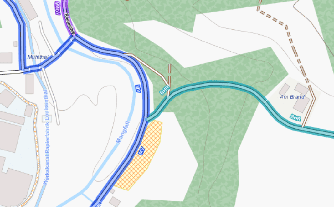
February 20, 2024 at 21:41 #55440February 22, 2024 at 15:04 #55446TobiasKeymasterHow does this with a darker turquoise work?
Developer of Elevate mapstyle
1 user thanked author for this post.
February 22, 2024 at 18:19 #55448ParticipantIt’s better, but I’d have to see it on a phone to compare.
1 user thanked author for this post.
February 24, 2024 at 12:18 #55482ParticipantMay i try it somehow?
February 24, 2024 at 13:08 #55483TobiasKeymasterMay i try it somehow?
Oh I was waiting for your feedback of checking the screenshot on a phone… have you?
I can provide a test version of you can install it manually.
Developer of Elevate mapstyle
February 24, 2024 at 13:12 #55484February 24, 2024 at 20:33 #55485TobiasKeymasterI’ve attached a test version, looking forward to your feedback. [Edit: test version removed]
Developer of Elevate mapstyle
February 24, 2024 at 21:15 #55487ParticipantThanks, but it helps only a little. That color just blends with other colors in my eyes, especially in towns.
Legend data is missing as well.February 24, 2024 at 21:46 #55488TobiasKeymasterAt first post I thought you couldn’t see the routes at all, now they are blending at times with other colors. Of course the latter is typically for color blindness (my dad has the red green one), so with a complex map style like Elevate this is near impossible to avoid, e.g. if a local route looks similar to a regional. But what should be avoided is when a route is invisible e.g. because it looks like the background in a forest.
Could you elaborate, and/or post screenshots of critical areas?
Legend data: do you mean included pdf for locus? This is standard Elevate, so this is normal.Developer of Elevate mapstyle
February 24, 2024 at 22:14 #55489ParticipantThat color is blending with everything, unfortunately. I have to concentrate very hard to see it, and my peripheral vision has a big problem detecting local bike routes.
Nevermind. I can live with that. 🙂February 25, 2024 at 00:03 #55491ParticipantHow do i add “legend pdf” to this demo style, please?
February 25, 2024 at 11:33 #55493ikoms
ParticipantHi Per
You might change the Color for you in the file elevate.xml
Just take it out of the zip-file and open it with a text-editor.
Than search for lcn. You will find this line:
<rule cat=”c_routes” e=”way” k=”network” v=”ocn|lcn”>
<line stroke=”#C018E0F2″ stroke-width=”2.65″ stroke-linecap=”butt” />Now search a hex-color of your choice in the wordwideweb and change 18E0F2 with that color. Safe the file and replace the one in the zip-file with it.
I did not test this.February 25, 2024 at 21:13 #55494TobiasKeymasterThat color is blending with everything, unfortunately. I have to concentrate very hard to see it, and my peripheral vision has a big problem detecting local bike routes.
Nevermind. I can live with that. 🙂Sorry, I think this is a really tough issue. I tried a color blindness/weakness simulator:
https://barrierefreies.design/barrierefreiheit-interaktiv-testen/farbenfehlsichtigkeit-simulierenIt’s recommended for all kinds of color blindness/weakness to use brightness differences, and not colors.
This collides with the concept of Elevate – emphasized roads/POIs/routes etc. in contrast to light background, so using different brightness levels for the former is not really possible. At least everything is rendered differently so e.g. a wall looks different than a cycling route, so this works for color blindness, but the additional information which is color coded with same brightness but different hue makes everything blends together. So the only thing what I can do is make some things stand out better from the background (as above), but blending together is near impossible to avoid with Elevate (if one counts in all kinds of color blindness/weakness). There’s too often information already coded in two levels, e.g. hikings paths: difficultiy via color and visibility via pattern. Best would be to leave out color for relevant information at all, but there’s just not enough possibilities to differentiate, so it would mean to leave out information – or use color for the less important one. At least for routes that’s now the case – you can see that it’s a route, but not what kind because of blending together.
I’m afraid that Elevate is in concept not really suitable; the best thing would probably to adapt it yourself as ikoms wrote above for your case; but in the end a mapstyle which is really accessible has to be designed for this from the beginning; maybe leave some stuff out, combine values etc.
How do i add „legend pdf“ to this demo style, please?
It has to be included in the zip-file like in the Locus download version:
https://www.openandromaps.org/wp-content/users/tobias/Elevate_Locus.zip
But I’ll release this version soon anyway, including Locus version of course.Developer of Elevate mapstyle
2 users thanked author for this post.
- AuthorPosts
- You must be logged in to reply to this topic.